Components and options
The configuration of a test involves many different components of the system: the measurement definition, one or more samples, the thermal cycle.
Under the hood, many other components are configured automatically or based on the user’s input: real physical devices (cameras, motors, power controllers, etc) and virtual components like sub-samples (Left/Right/Center, Base/Heigt), feedback regulators, the instrument itself, etc.
All these configurations are defined and saved in a consistent hierarchy of components both in the live instrument and in the output file.
Each component defines several options: all summed up, they represent the component’s configuration. Component configurations can be saved as Configuration presets, and recalled by their name to quickly get the component back in the desired configuration.
The user interface displays a component configuration as a Configuration panel: a structured list containing all available options (according to the user’s Access Management).
Components are organized in a hierarchical way, in order to make easier to search for them and to automate some actions on group of related components.
Configuration panel
A configuration panel lists all options related to a single component. For example, left-side panel in Configuring the test, is a configuration panel.
It can contain tabs, one for each major configuration section. For example, shape identification standards, listed as tabs in microscope Standards for Characteristic shapes identification, are configuration sections.
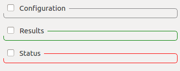
The options listing can be divided up to 3 boxes, one for each option role:
- Configuration: options which can be edited by the user.
- Status: options which are generally changed server-side to reflect internal status. The user can interact with some of them.
- Results: options which represent the output of a server process - usually read-only.
Box visibility can be toggled by clicking on the checkbox near the header.
Configuration options
Misura™4 offers a unified experience to visualize and edit any variable, generically called Option.
Options can represent proper Configuration variables, which the user can change to obtain an effect, but also the Status of some server-side variable, or a read-only Result from an analysis.
This distinction is well visible in any configuration panel, where options are grouped in 3 boxes - one for each role.
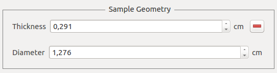
Options have types (String, Integer, Float, etc) which determine their appearance in the user interface.
All options share a common representation pattern: a label, containing the option’s name, and the option value. The option value can be represented as an input box (for text), a spinbox (for numbers), a slider and a spinbox (for number with boundaries), a combo-box (for selections), a checkbox (for booleans), etc.
Read-only options usually appear as simple text labels, without any control associated with editing. Some read-only option types, like tables, have no visual distinction: editing interactions are simply disabled.
If a numerical option has an associated measurement unit, it will be displayed between the label and the value.
Sub-options and groups
An option can have sub-options, which are hidden by default. Sub-options usually represent fine-tuning aspects of the parent option.
The presence of sub-options is indicated by a + symbol on the right of the option itself.
When clicked, subordered options will become visible below the main option, and the symbol will turn to - and produce the opposite effect (hiding sub-options).
Options might be grouped together in a titled box.
Option’s context menu
The options’s context menu can be visualized by right-clicking on the option’s label. Actions marked with (*) are available only when connected to a live instrument.
- enabled: some options might support an enabled/disabled state.
- Units: Change measurement unit. Only for numerical options defining a number.
- Set default value: resets to factory default.
- Check for modifications: (*) force to read the current value on the instrument’s side and refresh. It as the same effect as passing the mouse over the option.
- Option info: opens a dialog where all option’s attributes are listed.
- Detatch: opens a separate window containing the option label and value alone. This can be useful to view more clearly complex options, like tables.
- Aggregation: only visible if the option is an aggregate, se Aggregates.
- Presets: (*) lists all values in any saved configuration preset for this component. By clicking on a submenu action, the related value will be applied.
Compare menu
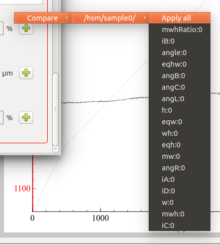
Compare lists all values for options with the same name in any other component on the server or in the test. By clicking on a submenu action, the related value will be applied.
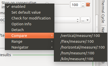
When an option have some sub-options, a Compare menu is also accessible from the +/- symbols used for exploding or collapsing the option group.
This menu contains an intermediate level, listing all components containing all the options grouped together.
For there, another submenu lists the option values one by one.
By clicking on an option:value couple you can apply that value to the option in the current group.
By clicking on Apply all, all the values from the referred group will be imported and applied to the current group’s options.
Range menu
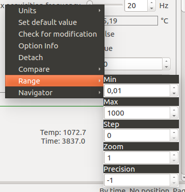
Numerical options also show a Range submenu, containing settings for:
- Min: the minimum value the option can have
- Max: the maximum value the option can have
- Step: step used for user-interface interactions (spinbox, slider)
- Zoom: The control slider will be zoomed into a region of valid values and be colored in red. This can be activated on options having a min/max and showing a slider. Zooming can be used in Motion Control.
- Precision: how many digits to show. They will be shown only if needed (eg: 1.20001 will be just 1.2 if precision is set to 4 or less). A less than 0 value means digits are unmanaged.
Tables
Tabular options have more complex editing interactions and they offer 3 context menus accessible with right-clicks.
Aggregates
The value of an option might be dynamically calculated according to options contained in other components. In this case, the option is referred as an aggregate.
For example, an option might be defined as the mean, a sum, a product or a tabular representation of numerous other options.
Involved options typically come from sub components. For example, if component A has 3 sub components A/B, A/C, A/D and each of them defines a Temperature option,
component A might define an aggregated Temperature option which is defined by the mean of all its subcomponent’s temperatures:
A.Temperature= (A/B.Temperature+A/C.Temperature+A/D.Temperature) / 3
Aggregated options can be recognized because they offer an additional context-menu submenu: Aggregation (see Option’s context menu), containing these options:
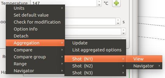
- Update: re-calculate the value of the aggregation.
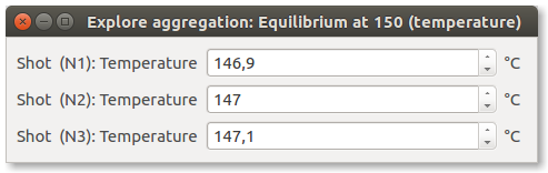
- List aggregated options: opens a new window showing the values of options involved in the aggregation.
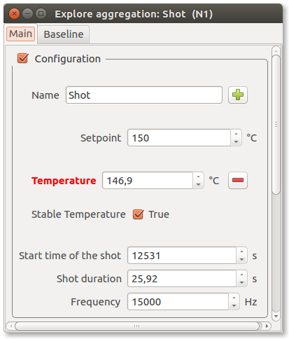
After a separator, all components involved in the aggregation are listed. Each component opens a sub-menu, with a View action, which will open a Configuration panel for the aggregated component where the involved option is highlighted in red.
A Navigator action is also available, giving access to the same actions which could be performed on the component’s node if selected in the Misura™ Navigator.
A special tabular aggregation produces a table, where each cell value derives from an option pertaining to another component. An additional sub-menu is appended to the Cell context menu, with the same functionality as the View action above.
Tables can also be merged together, following the same criteria.