Quickstart
This step-by-step guide will explain all actions required to:
- import a FlashLine data folder into Misura™,
- review and plot the results,
- configure and run a curve-fitting model.
From FlashLine to Misura™ Flash
Misura™ Flash needs to convert and compress a FlashLine test folder into a single HDF5 file in order to elaborate it.
- Open the Misura™ Browser by double-click on browser.exe.
- Locate the Data Sources sub-window, under the first Databases tab.
- Click on the Import button under the Recent files: column.
- Navigate to the
TestInformation.xmlfile, located in the root of your FlashLine test folder, and click Open. - The import process will require some minutes, depending on the speed of your computer, disk and network connection if the file is remote. The progress will be indicated by a dialog window containing a progress bar.
- After the import finishes, the file will be opened in a new tab, named after the title of the test.
- The default Summary Plots is shown.
More details on these steps, and alternative ways of importing files, can be found in the Importing FlashLine data section.
Test properties
Most FlashLine properties are mapped into Misura™ components, accessible through interface elements.
- Locate the Test Configuration right-area.
- Identify lateral vertical sub-tabs on the right and activate the Measure tab.
- Observe as the Test title and Test ID corresponds to your original FlashLine test.
- Activate the Sample 1 tab and check that Sample title and Sample ID are correctly reported from the FlashLine test.
For more details and a mapping between FlashLine and Misura™ fields, please read Navigating configurations.
FlashLine results
- Activate the Measure vertical sub-tab on the right of Test Configuration.
- The last entry is Summary. This is the grand-summary of all diffusivities contained in the test. It is thus quite complex to navigate.
- Right-click on Summary and select the action.
- The same table will open in a new, enlargeable table. Column headers contain the sample name and the diffusivity type.
- Right-click on the header and select for a more confortable view.
- Read Tables for more controls.
Numerous partial tables are contained in Sample <N> tabs.
- Activate Sample 1 tab. Deactivate the Configuration section checkbox. The Results section will remain active.
- Locate the Half Time table by scrolling through the panel.
- Right-click on the second cell (Half Time (s)) of the first row.
- From the context-menu, select (where
<X>is the temperature of the segment). - Select menu action .
- Review diffusivity from each single shot at the selected temperature. Each shot contributes to the mean value displayed in the column cell from which the context menu popped out.
The component’s tree can be reached anytime also by right-click on vertical tabs labels’ of the Test Configuration area.
- Right-click on Sample 1 tab label.
- Select .
- A new window will open, displaying the configuration tree spawning from
Sample 1component. - Expand any T<X> node on the left tree (where
<X>stands for the temperature of the segment). - Double-click on a N<Y> leaf node (where
<Y>is the shot number). - Individual shot information will appear in the right area.
Important shot information, contained in the Configuration section, are:
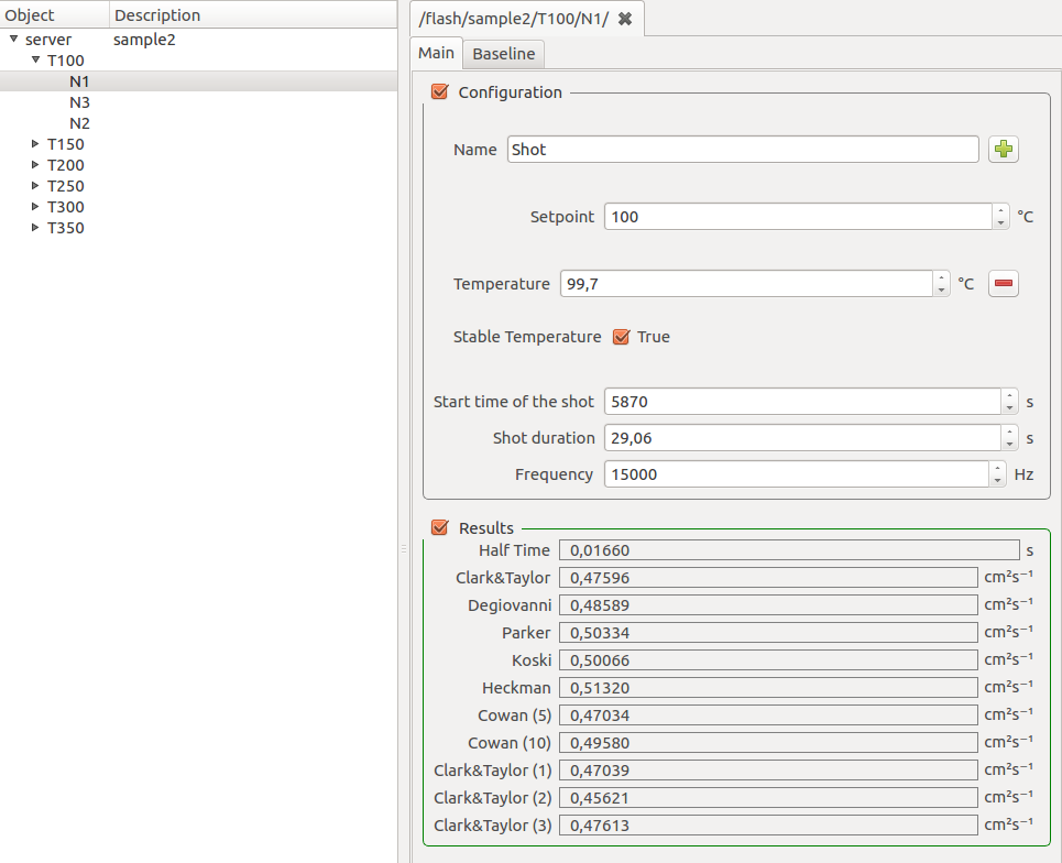
- Setpoint, the target temperature of the segment
- Temperature, the actual temperature recorded at the beginning of the shot.
- Stable temperature sub-option can be activated by clicking on the + button. Tells if temperature value was stable enough.
- Shot duration and Frequency
The Results section contains all diffusivity results.
Shots contain also a Baseline tab containing baseline information.
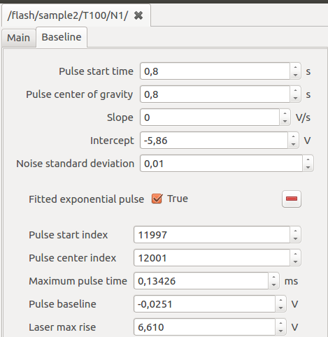
- Pulse start time calculated at the onset of laser pulse
- Pulse center of gravity calculated in the center of gravity of laser pulse (Use Center of Gravity to detect initial time)
- Slope and Intercept determine detected baseline linear regression
- Fitted exponential pulse checkbox indicate if the laser pulse could be successfully fitted with an exponential function
Plotting
The navigator is the most explicit way of performing plotting operations.
- Activate the Misura™ Navigator vertical tab in Test Configuration area.
- It is divided into Data, Properties, Formatting and optionally more horizontal tabs. Ensure the Data tab is active.
- Right-click on sample1 node of the tree. Tree nodes can also be addressed by their full path:
/flash/sample1. - Select context-menu action.
- A Sample Plot is created and displayed.
Default plots can be generated also by directly interacting with currently plotted curves.
- Right-click on a point-cloud representing the individual shot values for a temperature.
- Select the submenu. Notice as this shows exactly the same actions as if you clicked on the corresponding T<X> node on the navigator.
- Select the action, which will generate a thermogram overlap plot for the selected temperature segment (Segment Plot).
- Now right-click on any thermogram, select again .
- This will display the shot plot alone.
Zooming
Most common task on a shot plot is zooming in and out. There are several ways.
- Click on the
 toolbar button.
 - If you now hoover on the plot, mouse icon will be a sort of cross.
- Click on any point of the plot, then keep the left mouse button clicked and draw the rectangle you would like to zoom into.
- When you release the mouse, axes ranges will adjust in order to visualize only the selected rectangle.
- Click on the left-most white arrow to exit from the zooming tool.
- Click on
 toolbar button to reset all axes ranges to automatic.
Another method is by selecting an axis, then use the internal black square handles to move the ax range wherever you like. Instead, if you need to precisely set axes ranges:
- Select the axis.
- Activate Navigator vertical tab in Test Configuration, then Properties horizontal tab.
- Set Min and Max according to your needs.
Browsing plots
Generated plots can be considered as pages of a larger document. Each time a plot is generated, a new page is added to the document.
To browse document’s pages, you can click on 
 arrows on the toolbar.
After many plots are created, it might become cumbersome to navigate through them.
The Plots board area keeps an organized view of all plots generated in the current document.
- Generate all sample plots, by double-click on all sample nodes in the navigator tree.
- The board still shows only a screenshot of the initial overview plot, because it is showing the root level of the hierarchy.
- Click on the down arrow in the right area of the board. The board fills with all the sample plots generated before.
- Click on a sample plot screenshot. The corresponding plot will be loaded in the main plot area.
- Now generate some shot plots by double clicking on shot nodes in the navigator.
- Navigate one level down with the plots board’s down arrow.
- All generated shot plots are listed.
- Now click the up arrow to navigate in the upper level of the hierarchy.
- Click the home button to go straight to the root level.
Learn more in the Plots Board section.
Calling a curve-fitting model
- Right-click on a shot node on the navigator.
- Select the curve-fitting model you would like to run (eg: ). The model runner dialog will pop up in a new window.
- Configure the Flash Geometry and Start Values.
- Click Ok.
- Models can take minutes to run. A progress bar dialog will keep you informed about the approximative progress.
- When the execution ends, a new node will appear in the navigator, as a leaf of the shot node starting the calculation.
- The node is named after the model, eg: gembarovic.
Learn more in Flash Models.
Model plot
- Locate the output node generated by the model run and right-click on it.
- Select action.
- The model plot will appear in a new document page.

Learn more in Model Plot.
Viewing the results
Model run results are always repeated in two components (or navigator nodes): the model’s output and the shot. These are visible as Test Configuration vertical tabs when the Model Plot visible.
Both node and shot configuration panels display an additional horizontal tab titled after the model (eg: Gembarovic2D), after the Main tab.
The Main tab of the shot panel shows an additional field named after the model’s diffusivity output.
New model’s diffusivity tables are added to the parent segment and to the sample, collecting the only one diffusivity point we calculated.
Learn more in Analyzing results.